See how the Warhammer logo evolved over time, from Rogue Trader’s chaos to today’s clean corporate look, here is every 40k logo so far.
Every Warhammer 40k logo is a snapshot of where the game stood that year, what Games Workshop was pushing, and how badly it wanted to be taken seriously. Think about the version of the game, and you can date any version at a glance: the lettering starts as jagged Rogue Trader metal noise and slowly gets boxed into a tidy mark that sits on a shelf next to everything else GW sells, right up to the corporate look we see today.
Before we rewind through the eras, this short video runs through how much the 40k logo has actually changed over the years, the quick visual version of everything below:
How the Warhammer 40k Logos Have Changed Over Time
Updated on August 5, 2026, by Rob Baer with the latest on the 40k logo lineup.
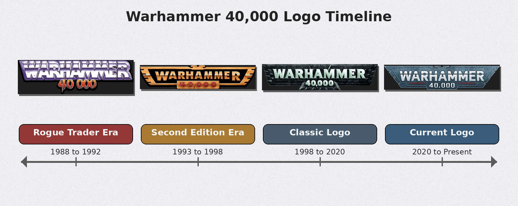
As you scroll that timeline, three things are obvious in every redesign, and they tell you which era you’re actually looking at:
- Typography: how spiky and hand-drawn the lettering is versus how rounded and shelf-readable GW made it.
- Framing: whether the logo runs loose or gets locked into a box so it reads the same on every product.
- Iconography: how much of the skull-and-eagle grimdark attitude survives each pass.
None of these redesigns are random. A new logo almost always shows up next to a new edition or a decision to reset the whole vibe, so we’re reading them backward: newest corporate mark first, then a straight rewind to where 40k kicked off.
New Games Workshop Logo and Its Impact on the Warhammer Brand
Quick sidebar before the logos themselves, because the parent brand sets the tone. When Games Workshop tidies up its own corporate mark, the 40k product logos usually follow within a release or two, so the direction GW picks for the company brand is a preview of what’s coming to the box art.
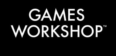
New 2025 Corporate Logo
The newest Games Workshop logo drops the gold, the gothic weight, and the attitude for a flat black-and-white mark that plays it safe. Say what you want about the rebrand, but here’s how it looks on the shelf and on the webstore: the same mark now runs across the webstore headers and the spines of the boxes you own, and sitting next to a universe built on skulls and chainswords, it reads more like a software brand than a wargame. It might work for corporate branding, but it’s a strange fit for the plastic we actually buy.
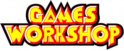
Original Logo
Taking the gold out of Games Workshop is like pulling the chainswords off a Space Marine; it just feels wrong. The old mark had swagger, that “we sell overpriced plastic and you love it” energy the new one quietly files away. With the parent brand sorted, the same tidy-up is exactly what has been happening to the 40k logo itself, so let’s rewind to where it started.
Warhammer 40000 Logo: Rogue Trader Era (1988-1992)
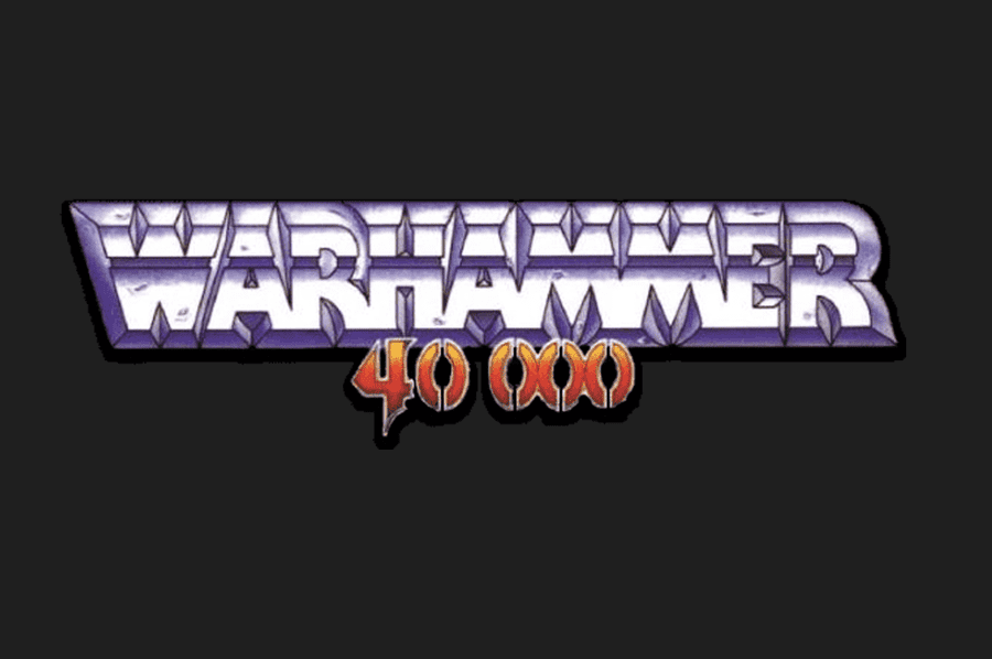
The Rogue Trader era Warhammer 40000 logo was loud, angular, and unapologetically weird, which made it perfect. This Warhammer 40k logo matched a time when the game didn’t care about polish and leaned fully into wild ideas and grimdark chaos.
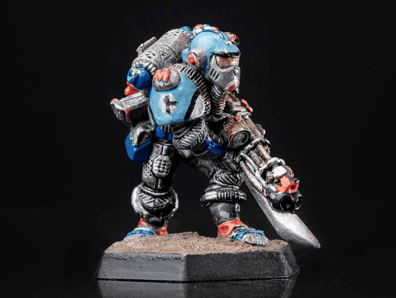
If you still have models from this time, you’re either a hobby hoarder or an archivist with a paintbrush. We’re talking beaky Marines, chunky metal minis, and rulebooks that read more like a D&D campaign than a streamlined wargame.
Rough rules and clunky models aside, this early Warhammer logo nailed the attitude that made people fall in love with 40k in the first place.
Warhammer Logo Evolution: Second Edition Era (1993-1998)
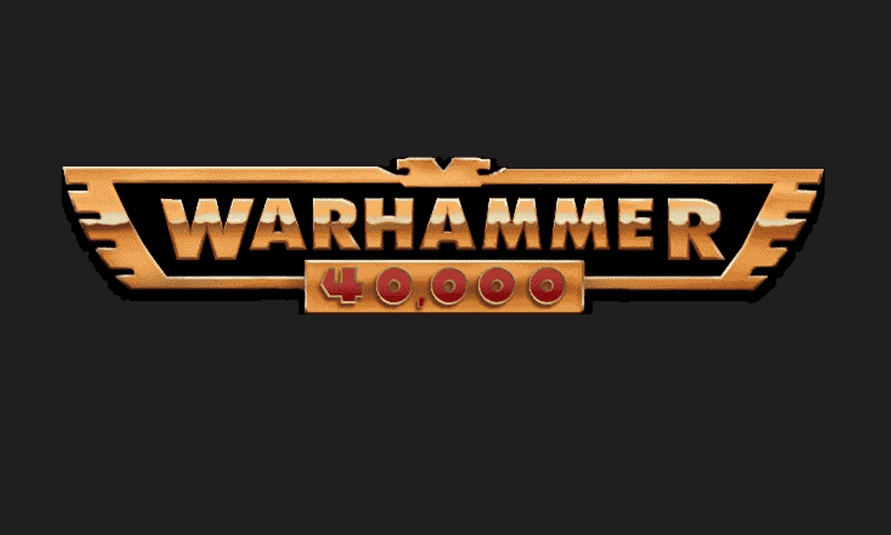
The 1993 to 1998 Warhammer logo was a real turning point, when Warhammer 40k started reaching for a wider audience without completely losing its edge. This version smoothed out the roughest parts and quietly set the foundation for the Warhammer 40k logos that came later.
Visually, you can see GW starting to “frame” the brand instead of letting it run wild. The lettering looks more controlled and less scratchy, the overall shape feels more balanced, and the presentation starts leaning toward a cleaner badge you can slap on a box and have it read instantly on a store shelf.
That mattered because 40k was shifting from cult-favorite chaos into something that needed to look legit next to other tabletop games, without losing the grimdark bite.
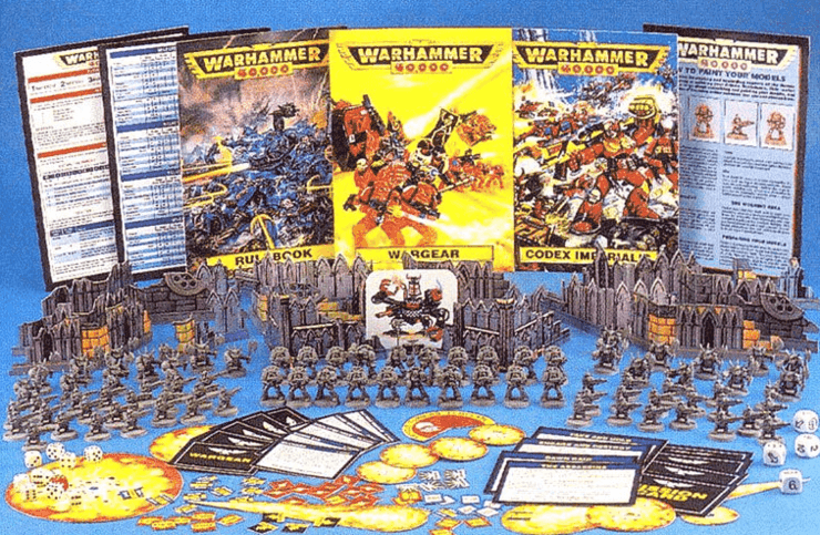
It also lined up with 2nd Edition 40k, a period when the game was growing fast and needed a Warhammer logo that felt more approachable while still looking like it belonged in the grimdark universe.
The Classic Warhammer 40k Logo (1998-2020)
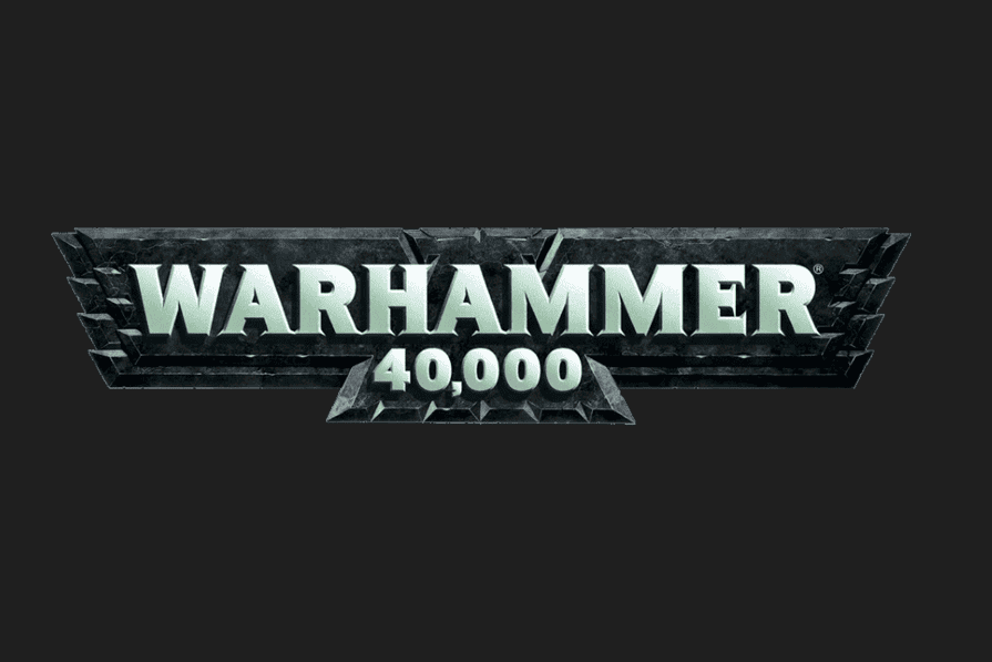
The 1998 to 2020 Warhammer 40k logo is the version most players think of when the game comes up. This Warhammer logo carried 40k through multiple editions and became the visual backbone of the modern hobby as Primaris Marines were introduced.
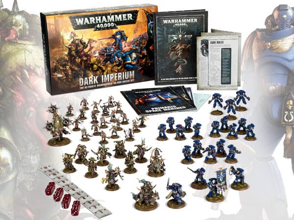
This mark gave 40k a stretch of visual consistency the game has rarely had since. Entire generations of codexes, starter sets, and White Dwarf covers lived under it, right up through the Dark Imperium relaunch.
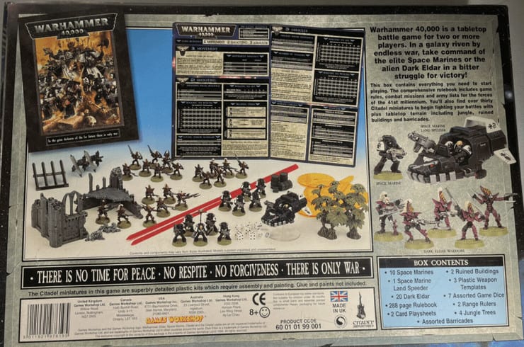
This logo first debuted on the third edition starter set, and what a box it was! This is the edition that got us (at least me) into the game, and it has all the nostalgia. The fact that some of those models only disappeared recently tells you how influential this period really was.
The starter pitted Dark Eldar (the name at the time) against the Black Templars. The game still had templates, and this was the first time we got the awesome whippy sticks; technically, they were rulers, but we all used them for some off-the-table combat.
Current Warhammer 40k Logo (2020-Present)
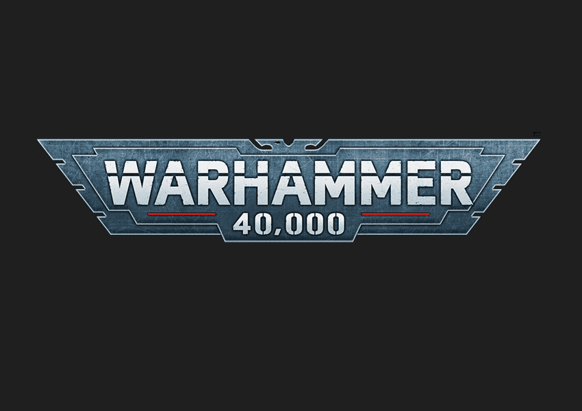
The current mark debuted with 9th Edition 40k, and it’s the most boxed-in version yet: tight capitals locked inside a hard rectangle instead of the looser banner that came before. That framing makes it read more serious, stamping the same way on a rulebook cover, a codex spine, and the side of every box on the shelf.
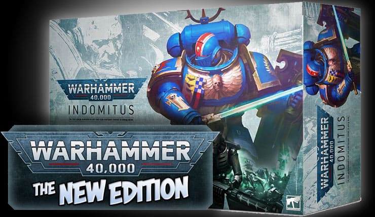
It debuted on the Indomitus launch box, which set the tone for the modern era of the game. Love or hate the design, this logo is now tied directly to how current 40k presents itself.

If past lifespans hold, this one’s probably sticking around a while. And honestly, it isn’t just on the boxes anymore: the same mark now runs across the Warhammer app, the web store headers, and the side panels of the packaging, so it’s the first thing you see whether you’re buying, gaming, or just scrolling. A logo built to sit on everything, everywhere, is a logo built for a global brand, not a niche hobby.
Final Thoughts on the Warhammer 40k Logo Evolution
Each of these Warhammer 40k logos marks a shift in how the game wanted to show itself, from wild Rogue Trader chaos to the polished corporate look we get now.
- Rogue Trader to the early nineties: Maximum attitude and “we’re weird on purpose,” with logos that feel like they escaped a metal album cover.
- Mid-nineties to 2020: Readability and shelf presence get prioritized, while still keeping enough grit to scream “grimdark” at a glance.
- 2020 to now: Clean, boxed, and consistent across products, because 40k is a global brand and it wants to look like it belongs everywhere.
Further reading: Why Games Workshop’s New Logo Misses the Mark runs the full side-by-side on the corporate rebrand, with more images and a closer look at exactly where it goes wrong.