![]()
It’s pretty wild how much the Warhammer 40k logos have changed over the years, evolving with the game to stay relevant amid an increasingly digital world.
Warhammer 40k Logos: The Wild Changes Over the Years
The evolution of brand logos over time is always interesting to observe, and it’s no different when we examine the significant changes made by Games Workshop to the Warhammer 40k logo since the 1980s.
Typically, such changes occur when they aim to rebrand and introduce a new edition. However, GW seems to take a thoughtful approach to logo redesigns, and each iteration represents substantial progress not only in the rules but also in the miniatures. Let’s start with the beginning!
Rogue Trader Era 1988-1992
 This is from the Rogue Trader Era, which started as early as 1987 and was used all the way until 1993. If you somehow still have some of the models from the beginning, you are a serious hobbyist!
The miniatures from this era might not have all the flash (unless you’re thinking about metal) of the new models. They are really awesome to look back at. This was also the start of so many of the awesome factions we still have and love today!
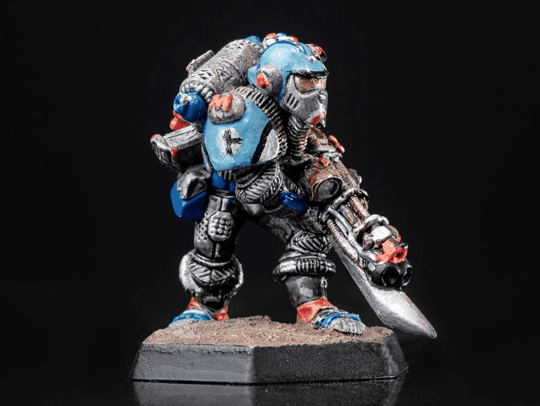 This is the very first Space Marine miniature, and while it came out a year before this logo started, it was a staple model at the time!
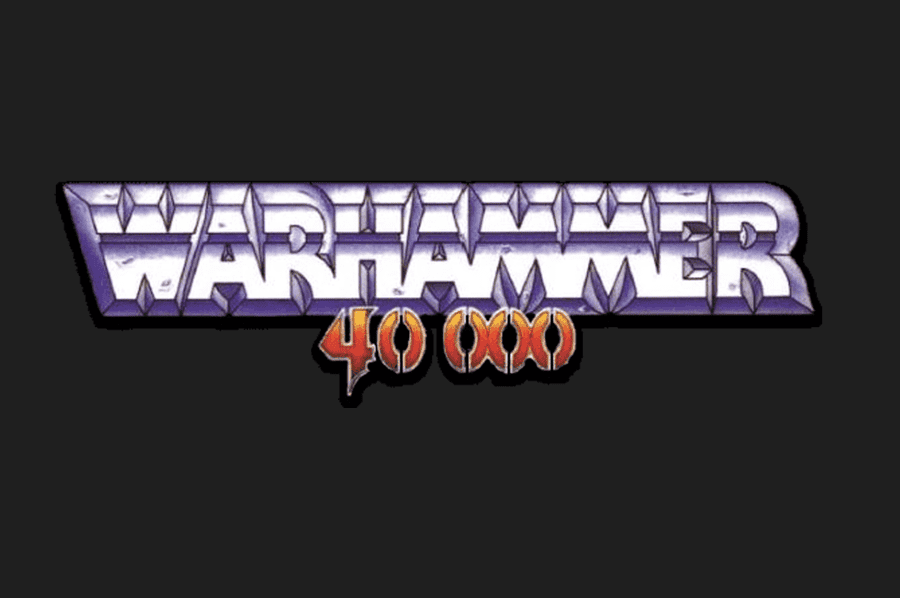
1993-1998 Logo
 This is really when the game moved from a much smaller IP and started to expand! Games Workshop came out with this logo right when the second edition started. It made sense for GW to update its logo for a less “heavy metal” and more “broader appeal.”
As a testament to its longevity this change still forms the basis of the current logo we have today.
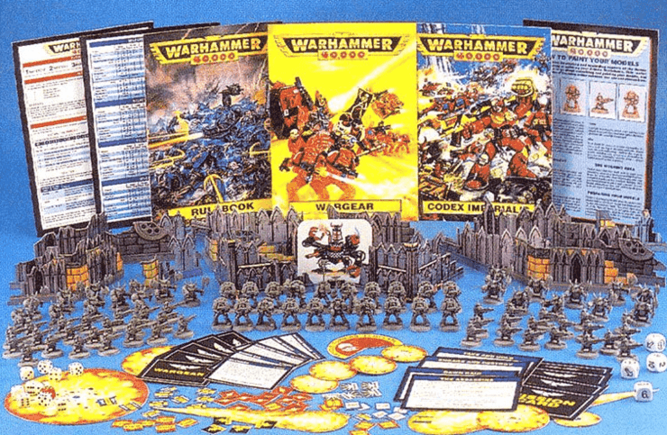
The second edition starter was a banger of a box! This pitted the Space Marines (Blood Angels) against the Orks, and it came with a ton of models. Plus, as you can see from the contents, there were tons of tokens, cards, and even a cardboard Ork Dreadnought!
Maybe the biggest deal here is that these models were plastic-injected molds! Nowadays, that might not seem like a lot, but back then, it was a huge deal as the game slowly started to move from metal to plastic.
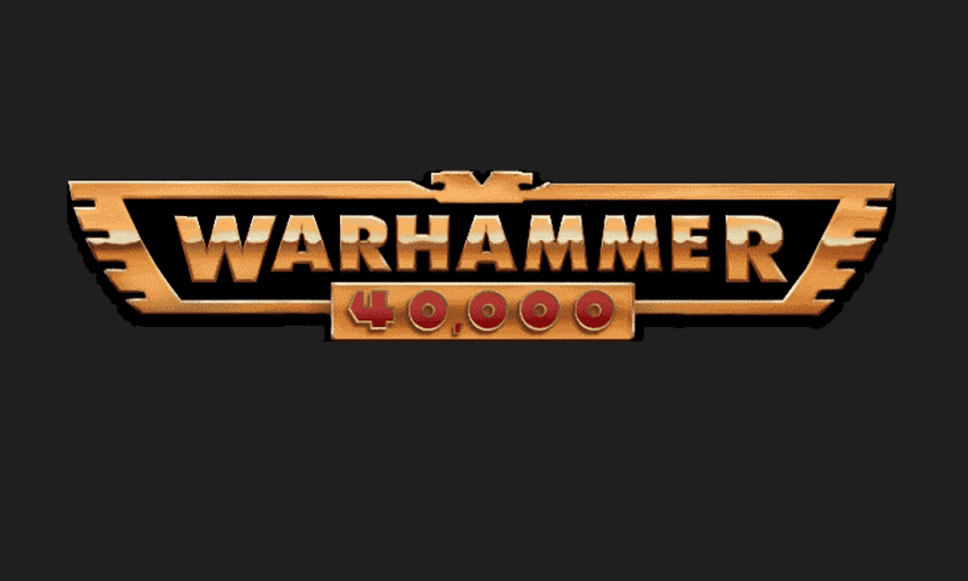
1998-2020 Logo
 This is the longest-standing logo in the game’s history and the one that so many of us think about when we think of Warhammer 40k! It took us from third Edition in 1998 to 8th Edition 22 years later in 2020.
This version is a new classic and likely sparked your interest in the game if you started playing within the past two decades.
 This logo first debuted on the third edition starter set, and what a box it was! This is the edition that got us (at least me) into the game, and it has all the nostalgia. The wild thing about this edition is that some of the models are still in the game today or just got updated a few years ago.
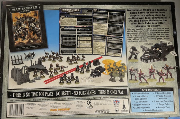 The starter pitted Dark Eldar (the name at the time) against the Black Templars. The game still had templates, and this was the first time we got the awesome whippy sticks—er, the rulers.
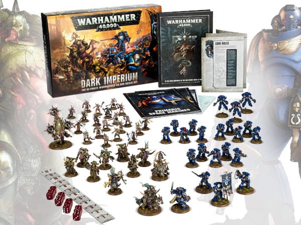
The Dark Imperium box was the final edition starter set to use this logo, and it’s still pretty sought after, as people still try to find it to this day. It also marked the beginning of the controversial Primaris Space Marines era.
Warhammer 40k Logos: 2020-Now
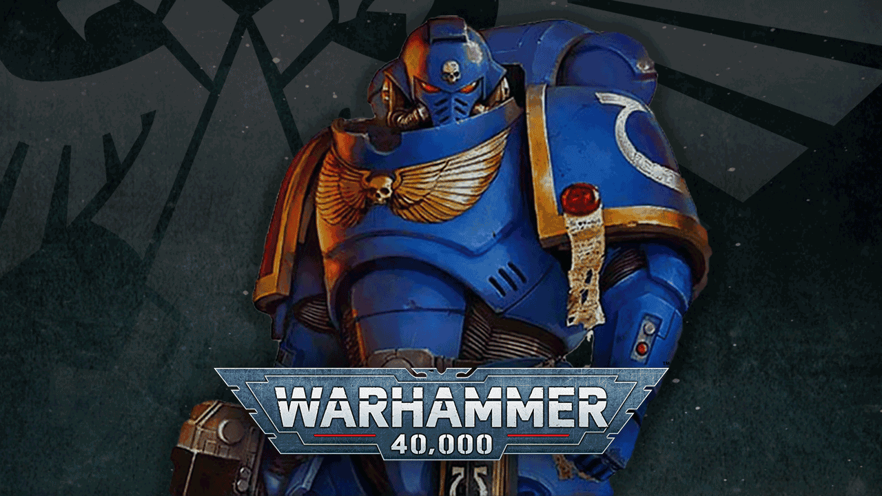
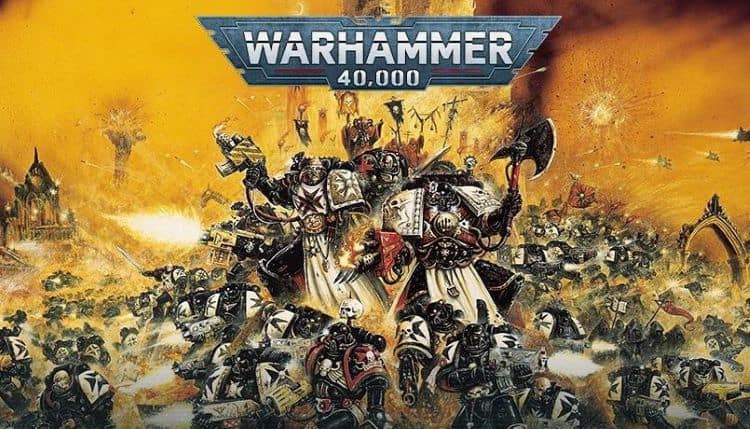
This is Warhammer’s current logo, which debuted with 9th Edition 40k. If you’re playing the game currently, you see this all over the place and on every book and box.
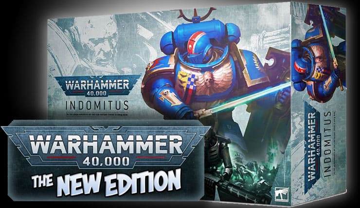
It was first seen on Indomitus, and that box is honestly one of the best values we’ve ever seen. If you were able to pick this box up for either Necrons or Space Marines, it was a great hobby experience during a difficult time in general!

So if the previous logo’s run is any indication, we might be seeing this for a really long time!
Overall, the changes in the Warhammer 40k logos over the years reflect the game’s evolution and expansion to a wider audience. Each logo represents a different era of the game, with its own unique miniatures, rules, and factions. Whether you are a veteran player or a recent hobbyist, it’s always interesting to look back at the game’s history and appreciate how far it has come.
All the Latest Warhammer Rules & Model Rumors
What do you think about how the Warhammer 40k’s logos have changed?