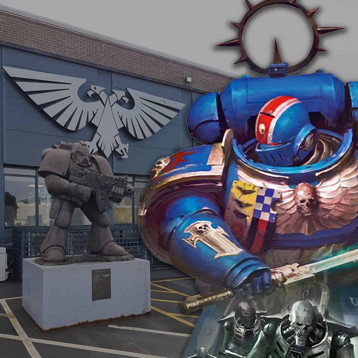
The classic Games Workshop logo is out; the new corporate wordmark is in and already showing up on new 40k box sets. Love or hate it, it’s here to stay .
Let’s talk about Games Workshop’s new logo. Back in July, GW quietly dropped what looked like their new corporate logo on a job listing page, and to say it’s uninspired would be putting it kindly.
It’s got that “we hired a rebranding agency that lives on LinkedIn” energy. Funny, sure. But here’s the part that actually matters now: it’s not just a quiet corporate page thing anymore. It is showing up on real products you can buy.
Gone is the bold, metallic gold we’ve come to associate with the company that brought us chainsaw-wielding space monks. In its place is a flat black-and-white wordmark that looks built for boardrooms, not battlefields.
40k Box Sets Branded With the New Games Workshop Logo
Updated on January 30th, 2026, by Rob Baer with the latest.
![]()
Yep, it is official. The new Games Workshop logo has moved from “spotted on a jobs page” to “printed on the stuff in your cart,” starting with the Christmas Battleforce boxes.
What changed: the classic gold-and-weighty look is out, and the new black-and-white corporate wordmark is in.
Why it matters: Once it hits retail packaging, it is no longer a rumor or a test. It becomes the face of the company on shelves, shipping boxes, and hobby desks. If you were hoping it would quietly disappear, the box art seems to say otherwise.
What’s Missing From the New Games Workshop Logo
![]()
This does not feel like a “Warhammer company” logo. It feels like a parent-company stamp you slap on a quarterly report. And the community noticed, because everyone is saying the obvious: it is clean, corporate, and weirdly joyless for a brand built on skulls, scrollwork, and dramatic nonsense.
![]() The old logo
The old logo
- No iconography: no hammer, no spires, no little visual hook to make it feel like Games Workshop instead of a generic brand label.
- No gold: love it or hate it, the old metallic look had presence. This version is pure “corporate stationery.”
- No vibe: it reads as a neutral wordmark first, and a hobby company last.
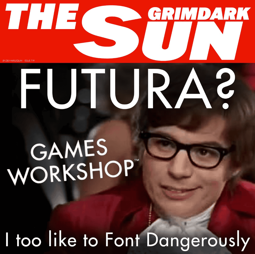
The Grimdark Sun satirically uses the Futura Condensed Bold font in their logo change meme.
Branding Strategy or Midlife Crisis?
![]() Even the small version of the navicon is super bland.
Even the small version of the navicon is super bland.
Now, to be fair, there is a real strategy argument here that goes beyond “it looks boring.” If GW wants the Warhammer 40k and Age of Sigmar brands to do the heavy lifting, a neutral parent logo is a way to stay in the background while the setting logos carry the personality.
Two ideas that make this make more sense:
- Parent brand vs. sub-brands: Games Workshop becomes the umbrella, while Warhammer becomes the identity you actually feel. That is great for licensing and brand partnerships, because you can present a tidy corporate front while keeping the grimdark flavor on the product lines.
- IP expansion readiness: if you are pushing further into media, licensing, and global retail growth, a simple wordmark is easier to reproduce everywhere, on everything, at every size. That kind of consistency matters when the brand leaves the hobby shop bubble.
And sure, with the Amazon series on the horizon, who knows what the long game looks like? But “strategic” doesn’t mean “beloved.”
To us, a corporate font like that requires a new tag line like “Empowering Imagination.” And honestly, if we start seeing buzzwords like “synergy” or “stakeholder value” in White Dwarf, it might be time to jump ship.
Games Workshop’s Logo & Warhammer 40k 10th Edition Parallel
The timing also lines up with the broader “simplify the presentation” vibe around 10th Edition 40k. The rules presentation got cleaner and more standardized (lots of units hit Legends this edition), and the new logo is the same idea applied to the company badge.
It’s less about flair and more about consistency, readability, and scale. Whether that’s good or bad depends on how much you liked the rough edges that made the hobby feel personal.
Final Thoughts From Us on the New Games Workshop Logo
Image Credit: Daily Dose of Warhammer
Will this new Games Workshop logo grow on people? Maybe. Either way, here are the two big takeaways from all of this, we think.
- Takeaway one: this is no longer a probable change. If it’s on Battleforce packaging, it’s rolling into the real world fast and here to stay.
- Takeaway two: it reads like a parent-company mark, which probably tells you exactly where GW wants the spotlight to sit: on Warhammer, not on Games Workshop. Which lets them expand into more areas of revenue.
What to watch for next: keep an eye on whether it starts replacing the old look across core ranges, store signage, and event branding. Once you see it everywhere, that is when the rebrand stops being a meme and starts being the new normal.
💡 Want more context?
See How the Warhammer 40k Logos Have Changed Over the Years
I think it’s fitting. They’ve removed all grim dark from the lore, and all customization in the game. Everything about it is corporate and lowest common denominator.
It’s a purely corporate logo and is a rehash of a more original one – we can still love and make use of the They’re a jewel in the crown of British manufacturing success stories and draw in billions. If they are after investment and their sustained growth planning in future with non- fans and corporate suits this is just what they have to do to look as serious as they already are on paper.
Saying it for what it is, good article, Just wow, i really don’t want to know how much they paid for that 2min effort in Microsoft paint. I mean yea the old logo is a little 80’s hair metal, but cmon this new look is way too far into meh?!.
I mean, the font name sounds like it was the art direction.
I thought this looked familiar, so I pulled out my 1980 copy of “Dr Who- The Game of Time and Space.”
Looks like they stole the Topman logo or used the designer of it. If you have to go and google that logo then it shows how totally unremarkable this new GW logo really is
The new logo is bland, sure. In their defence, they’re trying to gain some appeal in the wider audience. The old logo was very dated and whilst it had character, it wasn’t very appealing to people that aren’t already into figurines and tabletops. The new one is bland enough to be taken seriously by everyone. Bland is not always bad. I’d harp more on their practices, not their logo.
Great article. It’s such a shame as the old logo has so much soul and flavour. The soul is being ripped out of the company, and I’m losing interest in GW products and their games. Plenty of great games coming through to jump to with more personality. Trench Crusade come to mind.
Agreed..bladder than all hell.
Well GW now has the trifecta. They purged out the soul of their logo, the soul of the game. And said no to cosplay. Sad. Very sad. Oh and still charging a fortune for plastic.
Not an expert here, but I always thought that a logo was supposed to stand out, grab attention and say something bold about your company.
This new logo just seems so, bland. It’s almost like they’re embarrassed about themselves and trying to hide who and what they are.
Very bitter article, hard read. And alot of info just plain false.
Not one of your best.